Table of Contents
User Manual::Report Charts
Charts Functionality for Reports of Summary Type having a groupby condition
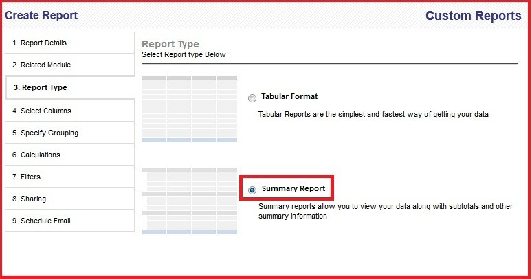
We have added the Reports Charts Functionality to the Reports Module. Every Report that is generated of type summary and having a group by condition will be accompanied with a chart. By default the charts are of type Horizontal Bar Chart and Pie chart. The following screen-shot shows how to create the report as a summary report. In the step 3 of the report creation wizard, there is an option to select tabular report or summary report.
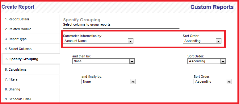
Next, in step 5 of the report creation wizard, there is an option to select columns for grouping the report. The following screen-shot shows the summarize information by column.
Adding Group By time functionality for report generation
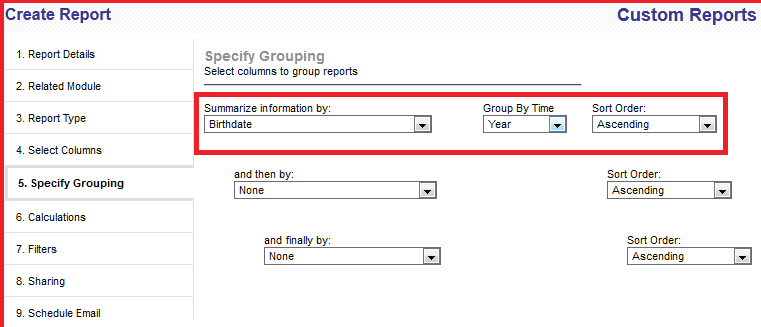
We have added a new feature to group by report by time. While creating a summary report, if we are selecting the group by condition as a date field, then a new drop down will be visible which will allow you to group by time viz, group by month, quarter or year.The following screen-shot shows a report generated for contacts module with the group by field as the Birthdate. In this case, when the field birthdate is selected, the new drop down group by time will become visible next to it.
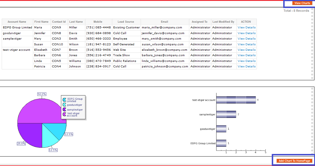
After the report has being generated, the charts will be visible in the bottom of the reports page itself as shown in the following screen-shot.
A new button has been added called “View Charts” to the top right corner and bottom left corner of the reports page. The above screen-shot shows the button “View Charts”. On click of “View Charts” button, the page navigates to the charts element present at the bottom of the reports detail page. The following screen-shot shows the reports charts after the click of view charts.
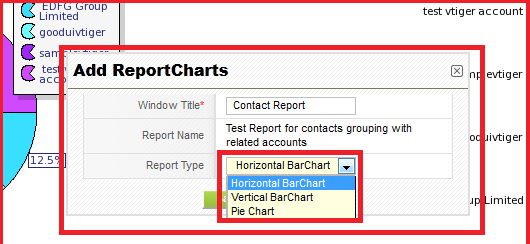
Also, a new button has been added at the bottom right of the charts page called “Add Chart To Home Page” as shown in the above screen-shot. On click of this button, it is possible to add this report chart directly to the homepage as a widget. The following screen-shot shows that on click of this button a new popup will be shown. In this popup the report name will be automatically filled and the user will be allowed to input a Widget Name that will be visible on the homepage. Also, the chart type can be selected using the dropdown for Chart Type. The following screen-shot shows this.
The ChartType drop down has 3 values : Horizontal Bar Chart, Vertical Bar Chart and Pie Chart as shown in the following screen-shot.
After clicking on the save button a message will be displayed that the widget has been added to homepage successfully.
Adding Report Charts from HomePage
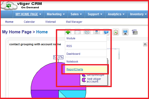
We have added a new Widget Type called “Report Charts” in the Home Page. The following screen-shot shows this newly added Widget Type.
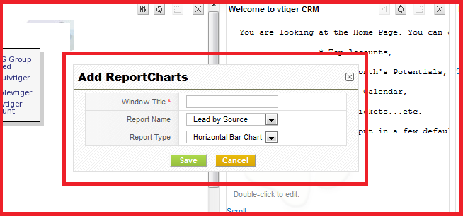
On clicking on the Report Charts Entry which is a hyperlink, we will get a new popup. The following screenshot shows the popup.
In this Popup, the user can select 3 things:
- Window Title
- Report Name: This field is a drop down which has all the report names which are of summary type and having a group by condition.
- Report Type: drop down to select the type of chart(Horizontal Barchart,Vertical Barchart or Piechart).
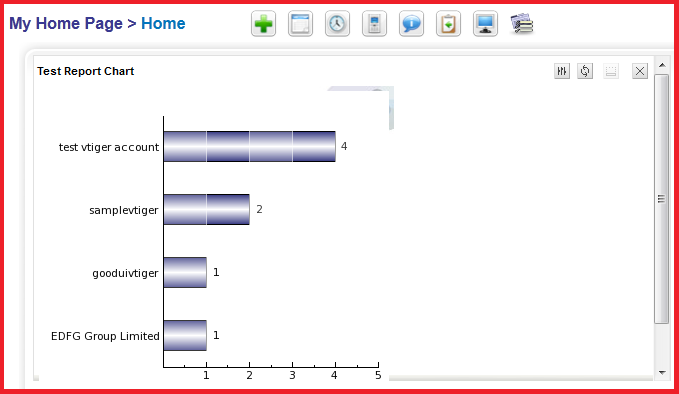
On click of the save button in the popup, the widget will be added to the homepage as shown by the below screenshot.
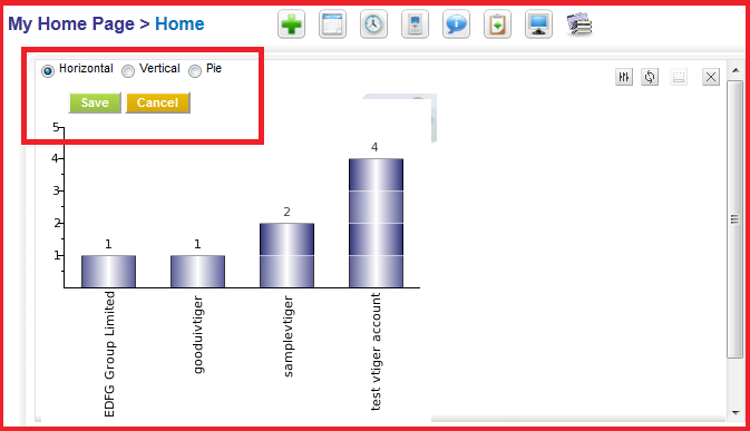
There is also an edit icon which allows the user to change the chart type even after adding the chart to the homepage.
The following screen-shot shows the edit icon on the homepage Report Charts widget.
In the above we can see that we have selected the Horizontal Barchart and trying to change the charttype from vertical to Horizontal. On click of save button, the Vertical BarChart will be replaced with the Horizontal BarChart.
The following screen-shot shows this:
